I keep going on about Tufte stuff.
I find sparklines really really amazingly cool. I currently use them in my weekly reports for management thanks to some software from Bizzantz and a spreadsheet I kept all summer. I’m using the free version and will buy up once we decide on a license count and version that we need.
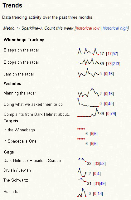
Pretty rad eh? I replaced the measured items of this example using photoshop, and it’s not as nice as it could be, but I can throw the real thing together in MS Word at the end of the week pretty quickly and send it up. I like it!
Lessons learned so far:
The first week I played with them I didn’t align them vertically, which made it less obvious that as the assholes stopped doing what they were asked to do that President Scroob got more complaints about them. It looks like too many of them were manning the radar, but who knows? Is there really a correlation between Druish / Jewish gags and gags involving Barf’s tail?
Also, the first week I relied on the ‘sparklefont’ that Bizzantz uses to create the sparklines. It is awesome, but images translate a bit better from e-mail to e-mail to executive copy / paste, and so on.