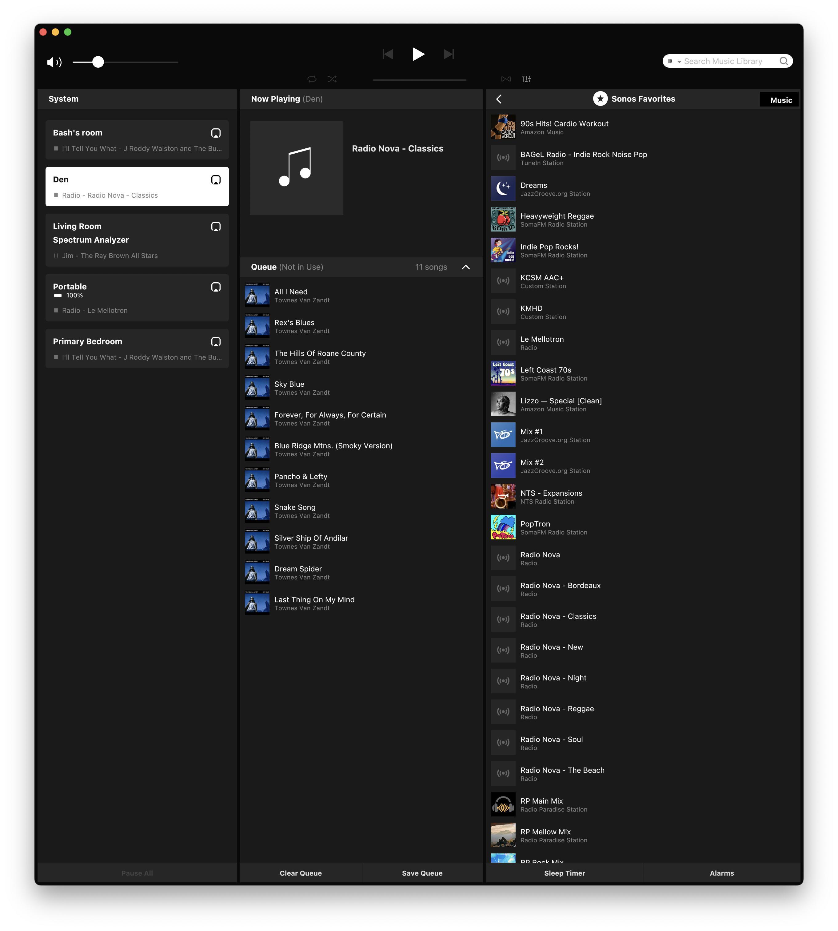
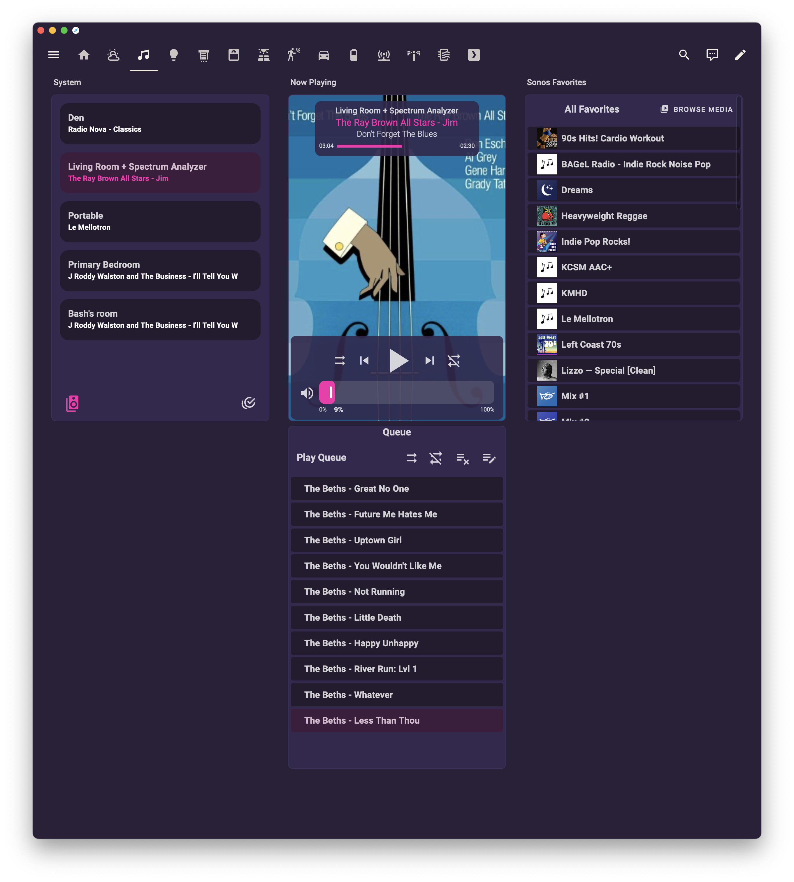
this is all so stupid. I assume accessing http streams and favoriting them is not a revenue opportunity and thus prioritized somewhere below first party enlightenment sound daemon support, so the “new” mobile app hard-rake-staircase-ollie 🙄 (the designers did a great job, the engineering decisions worry me) still can’t do what I’ve been doing for nearly fifteen years.

home assistant can, clumsily, so I faked up the old UI with four sonos cards each locked into single mode.

The sonos mac app on my machine this morning. Sonos has used this hokey three column layout for a very long time. Left: speaker selection and grouping. center: now playing artwork over playlist. right: source services, media library, or favorites, currently displaying favorites.

home assistant using the synthwave theme (purple with pink headers and white text), with a music dashboard selected.left column: speaker selection. center: now playing artwork over playlist for the selected speakers. right: media selection showing “browse media” (useless) and Favorites

the same dashboard on my phone, which collapses all of the columns into one, is incredibly silly, but works just fine for me, assuming I can trick myself into remembering to use it instead of opening the bad app first, which I tend to do.